Check nearby libraries
Buy this book

From the publisher's website:
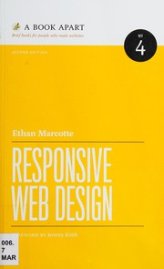
"From mobile browsers to netbooks and tablets, users are visiting your sites from an increasing array of devices and browsers. Are your designs ready? Learn how to think beyond the desktop and craft beautiful designs that anticipate and respond to your users’ needs. Ethan Marcotte will explore CSS techniques and design principles, including fluid grids, flexible images, and media queries, demonstrating how you can deliver a quality experience to your users no matter how large (or small) their display."
Check nearby libraries
Buy this book

Previews available in: English French
| Edition | Availability |
|---|---|
| 1 |
aaaa
|
| 2 |
zzzz
|
| 3 |
zzzz
|
| 4 |
cccc
|
| 5 |
zzzz
|
| 6 |
cccc
|
Book Details
Table of Contents
Edition Notes
Title from PDF title page (viewed January 16, 2015)
Includes bibliographical references (p. 148-151) and index.
External Links
The Physical Object
Edition Identifiers
Work Identifiers
Links outside Open Library
Community Reviews (0)
History
- Created November 1, 2021
- 3 revisions
Wikipedia citation
×CloseCopy and paste this code into your Wikipedia page. Need help?
| December 20, 2023 | Edited by ImportBot | import existing book |
| December 8, 2022 | Edited by ImportBot | import existing book |
| November 1, 2021 | Created by ImportBot | Imported from Internet Archive item record |


